

Curtain Raiser Block
Captivate visitors with animated sections. Dual-layer backgrounds and smooth scroll effects create memorable first impressions.
Dual-layer animated backgrounds with scroll-triggered circular reveal. Each layer supports images or videos, creating cinematic intros for landing pages and hero sections.
Media Section
Scroll to trigger animations. The background image expands with gutter effects while content slides into view from the bottom. Perfect for high-impact hero sections and feature highlights.
Showcasing static, without animation, and not contained
Media Section
Scroll to trigger animations. The background image expands with gutter effects while content slides into view from the bottom. Perfect for high-impact hero sections and feature highlights.
Showcasing static, without animation, and not contained
Media Section
Scroll to trigger animations. The background image expands with gutter effects while content slides into view from the bottom. Perfect for high-impact hero sections and feature highlights.
Showcasing with animation, and contained
Media Section
Scroll to trigger animations. The background image expands with gutter effects while content slides into view from the bottom. Perfect for high-impact hero sections and feature highlights.
Showcasing with animation, and contained

Media & Content Split
Flexible split layouts with custom width ratios that stack responsively
Set any width ratio you want—30/70, 40/60, 50/50, or custom widths in px, %, em, rem, vw, or vh. Media and content sit side-by-side on larger screens, then stack at your chosen breakpoint.
Features:
- Content scroll mode – Image stays fixed while content scrolls (perfect for long-form content)
- Flexible width control (not locked to 50/50)
- Multiple unit support (px, %, em, rem, vw, vh)
- Image support with focal point control
- Stack at custom breakpoint (phone, tablet, or laptop)
- Content scroll or stack toggle
- Overlay color and opacity controls
- Duotone image filters
- Full typography and spacing controls
Perfect for:
- Long-form content with visual anchor
- Editorial layouts
- Feature descriptions with detailed copy
- Storytelling sections
- Service pages with extended descriptions
Why Groundworx Core?
Long-form content that demonstrates scroll:
Build client sites faster with professional WordPress blocks and extensions. No page builder bloat, no proprietary systems, just modern WordPress standards.
Unified Breakpoint System
Set your responsive breakpoints once. Every block respects them automatically. No more managing responsive behavior across dozens of individual blocks.
Extensions to Core Blocks
WordPress core blocks get professional controls—stack columns, set widths per breakpoint, sticky positioning, text alignment per device, and more.
Custom Blocks Built for Real Work
Accordion, Tabs, Cards, Heros—every block designed for actual client projects, not just demos. Clean code, semantic HTML, accessible by default.
Performance First
No jQuery, no legacy code. Performance-optimized video loading, CSS-based animations, minimal JavaScript. Fast sites without compromise.

Media & Content Split
Flexible split layouts with custom width ratios that stack responsively
Set any width ratio you want—30/70, 40/60, 50/50, or custom widths in px, %, em, rem, vw, or vh. Media and content sit side-by-side on larger screens, then stack at your chosen breakpoint.
Card
Pre-structured classic card container with flexible inner content blocks
Card
Pre-structured classic card container with flexible inner content blocks,
See it for yourself!
Card
Pre-structured classic card container with flexible inner content blocks,
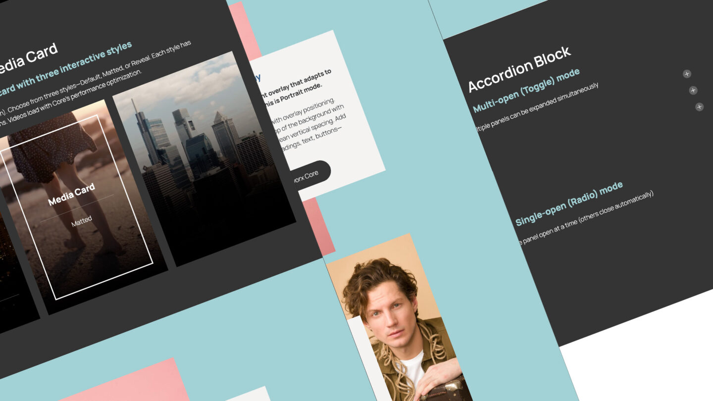
Media Card
Dual-layer media card with three interactive styles
Add two media layers (images, videos, or both). Choose from three styles—Default, Matted, or Reveal. Each style has unique hover interactions. Videos load with Core’s performance optimization.
Media Card
Default
Media Card
Matted
Media Card
Reveal
Card Reveal
Hover to reveal the back layer. Front layer shows an image, back layer can be image or video. Reveal amount adapts to content height automatically. On touch devices, displays as a normal card without interaction.

Card Reveal
One-layer interactive card with content-based reveal
Card Reveal
Two-layer interactive card with content-based reveal
Card Reveal Lift
Hover to “lift” the front layer and reveal content underneath. Set a fixed reveal height as a ratio or percentage. Front layer shows an image, back layer can be image or video. On touch devices, displays as a normal card.

Card Reveal Lift
One-layer interactive card with content-based reveal

Card Reveal Lift
Two-layer interactive card with content-based reveal
Dynamic Flow
Query-powered carousel that pulls from any post type. Filter by taxonomy, date, author, keyword, or format—or switch to Curated mode and hand-pick posts. Design your slide template with any blocks, set slides per breakpoint, control animation timing, and pause videos on inactive slides. Full responsive controls at every screen size.
Auto Scroll, fixed width at breakpoint
Auto-scroll creates a continuous marquee effect that smoothly cycles through slides. Adjust the scroll speed and combine with loop mode for an endless stream of content.
Groundworx Carousel Release 3.0.1
Bug Fixes
Groundworx Query Loop New release 2.0.1
Bug Fixes Improvements
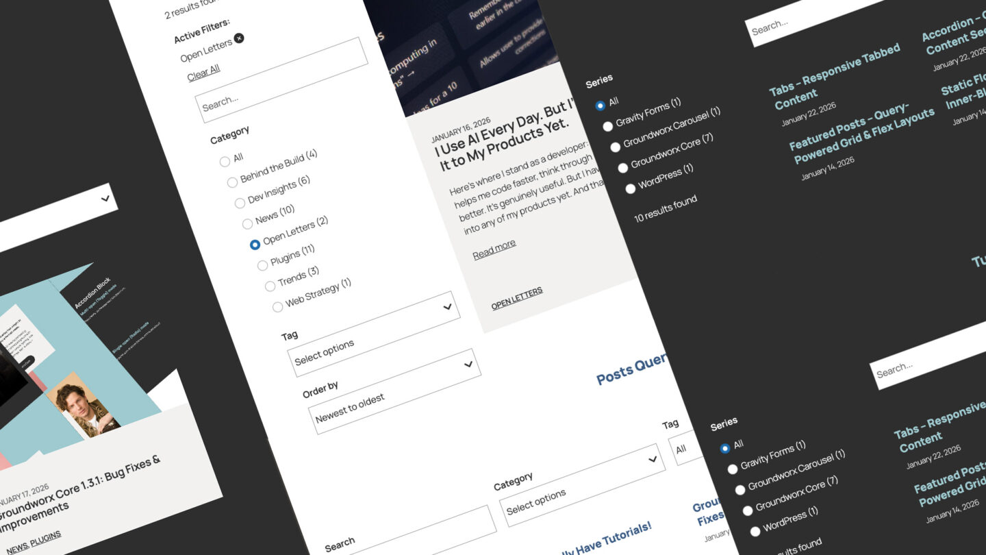
How to Get Weighted, Relevant WordPress Search Without External Services
Executive Summary WordPress powers over 40% of the web. Its built-in search has never kept pace with the content discovery…
Groundworx Query Filters Release 2.0.0
Settings Page Global Search Search Index Per-Post Search Controls Enhancements Breaking Changes
Groundworx Query Filters: Native Filtering Architecture for the WordPress Block Editor
Most filter plugins are monolithic. WordPress moved to modular. The WordPress Block Editor introduced a modular content architecture. Blocks are…

Groundworx Tabs & Accordion 1.1.2 is here.
Brings a full overhaul of how active colors are applied to triggers and panels Now handled through Interactivity API directives…
Groundworx Showcase 2.0.0: Interactivity API, Reactive State, and Composable Carousel Architecture
This is the biggest architectural change since launch. The entire carousel frontend runs on the WordPress Interactivity API. Every interaction,…
Groundworx Carousel 3.0.0: New Engine, New Architecture, Same Mission
Groundworx Carousel 3.0.0 is live on WordPress.org. This isn’t a feature update — it’s a rebuild. New carousel engine, new…
Center align with scale & opacity
Center-aligned slides with scale and opacity transitions create a focus effect that draws attention to the active slide while gracefully fading the surrounding content.
Groundworx Carousel Release 3.0.1
Bug Fixes
Groundworx Query Loop New release 2.0.1
Bug Fixes Improvements
How to Get Weighted, Relevant WordPress Search Without External Services
Executive Summary WordPress powers over 40% of the web. Its built-in search has never kept pace with the content discovery…
Groundworx Query Filters Release 2.0.0
Settings Page Global Search Search Index Per-Post Search Controls Enhancements Breaking Changes
Groundworx Query Filters: Native Filtering Architecture for the WordPress Block Editor
Most filter plugins are monolithic. WordPress moved to modular. The WordPress Block Editor introduced a modular content architecture. Blocks are…
Groundworx Tabs & Accordion 1.1.2 is here.
Brings a full overhaul of how active colors are applied to triggers and panels Now handled through Interactivity API directives…
Groundworx Showcase 2.0.0: Interactivity API, Reactive State, and Composable Carousel Architecture
This is the biggest architectural change since launch. The entire carousel frontend runs on the WordPress Interactivity API. Every interaction,…
Groundworx Carousel 3.0.0: New Engine, New Architecture, Same Mission
Groundworx Carousel 3.0.0 is live on WordPress.org. This isn’t a feature update — it’s a rebuild. New carousel engine, new…
Large centered slides with autoplay
Large centered slides with autoplay and scale effects work great for hero-style content displays. The half-arrow navigation keeps the interface minimal.
Groundworx Carousel Release 3.0.1
Bug Fixes
Groundworx Query Loop New release 2.0.1
Bug Fixes Improvements
How to Get Weighted, Relevant WordPress Search Without External Services
Executive Summary WordPress powers over 40% of the web. Its built-in search has never kept pace with the content discovery…
Groundworx Query Filters Release 2.0.0
Settings Page Global Search Search Index Per-Post Search Controls Enhancements Breaking Changes
Groundworx Query Filters: Native Filtering Architecture for the WordPress Block Editor
Most filter plugins are monolithic. WordPress moved to modular. The WordPress Block Editor introduced a modular content architecture. Blocks are…
Groundworx Tabs & Accordion 1.1.2 is here.
Brings a full overhaul of how active colors are applied to triggers and panels Now handled through Interactivity API directives…
Groundworx Showcase 2.0.0: Interactivity API, Reactive State, and Composable Carousel Architecture
This is the biggest architectural change since launch. The entire carousel frontend runs on the WordPress Interactivity API. Every interaction,…
Groundworx Carousel 3.0.0: New Engine, New Architecture, Same Mission
Groundworx Carousel 3.0.0 is live on WordPress.org. This isn’t a feature update — it’s a rebuild. New carousel engine, new…
Fade transitions
Fade transitions provide a smooth crossfade between slides instead of sliding motion. Numbered pagination lets visitors jump directly to any slide.
Groundworx Carousel Release 3.0.1
Bug Fixes
Groundworx Query Loop New release 2.0.1
Bug Fixes Improvements
How to Get Weighted, Relevant WordPress Search Without External Services
Executive Summary WordPress powers over 40% of the web. Its built-in search has never kept pace with the content discovery…
Groundworx Query Filters Release 2.0.0
Settings Page Global Search Search Index Per-Post Search Controls Enhancements Breaking Changes
Groundworx Query Filters: Native Filtering Architecture for the WordPress Block Editor
Most filter plugins are monolithic. WordPress moved to modular. The WordPress Block Editor introduced a modular content architecture. Blocks are…
Groundworx Tabs & Accordion 1.1.2 is here.
Brings a full overhaul of how active colors are applied to triggers and panels Now handled through Interactivity API directives…
Groundworx Showcase 2.0.0: Interactivity API, Reactive State, and Composable Carousel Architecture
This is the biggest architectural change since launch. The entire carousel frontend runs on the WordPress Interactivity API. Every interaction,…
Groundworx Carousel 3.0.0: New Engine, New Architecture, Same Mission
Groundworx Carousel 3.0.0 is live on WordPress.org. This isn’t a feature update — it’s a rebuild. New carousel engine, new…
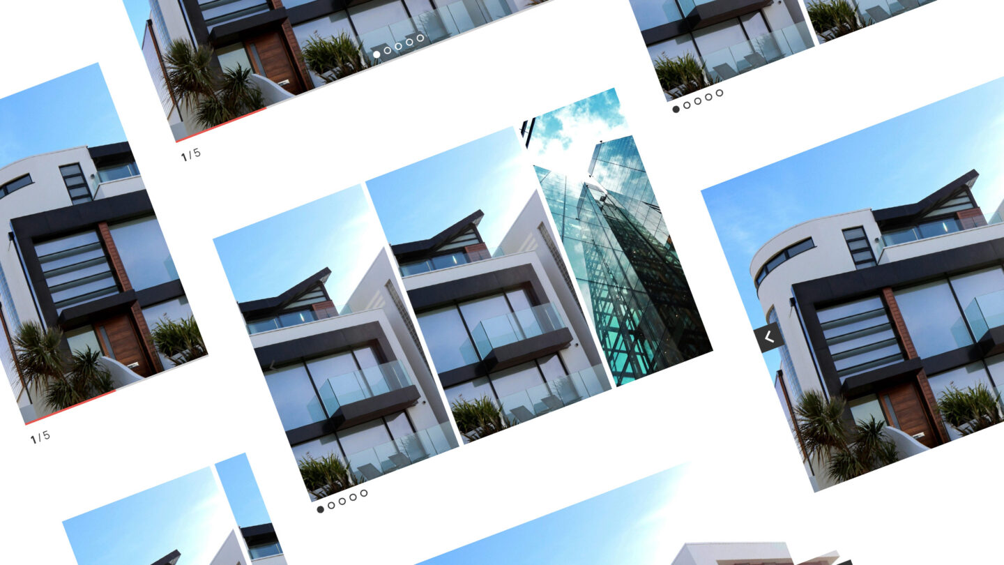
Static Flow
Manual carousel with full control over each slide. Add any blocks inside—videos, images, text, buttons, whatever you need. Set loop mode, slide justification, width, and animation duration. Pause inactive media keeps videos from playing until their slide is active. Add a progress bar, pagination dots, or arrows. Perfect for testimonials, video galleries, or feature showcases.
Video carousel with autoplay
Auto-playing video slides with a progress bar indicator. Pause inactive media keeps videos from playing until their slide is active.
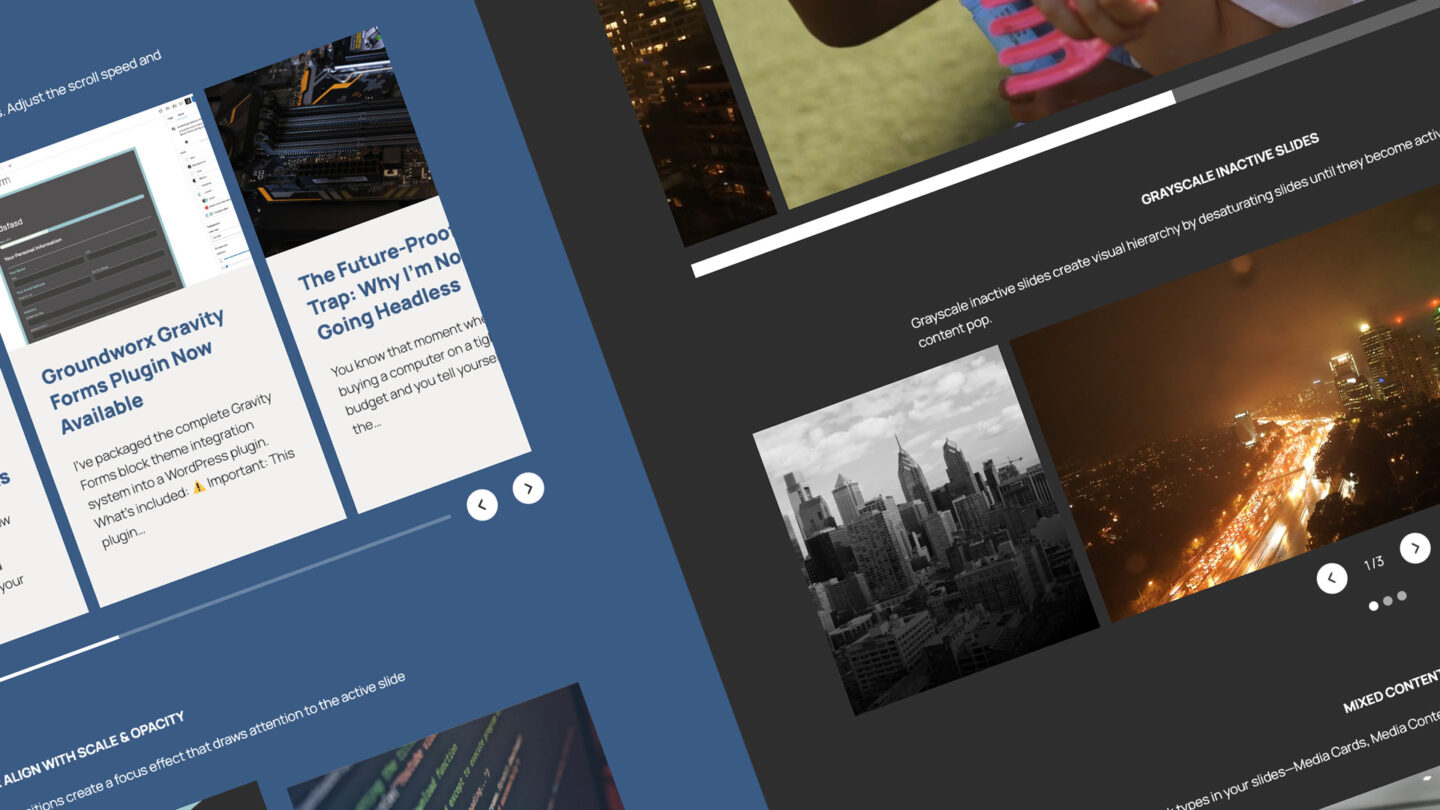
Grayscale inactive slides
Grayscale inactive slides create visual hierarchy by desaturating slides until they become active, making the current content pop.
Mixed content slides
Mix any block types in your slides—Media Cards, Media Content Split, Card Overlays—each with its own layout and animations.
Media & Content Split
Accordion Block
Multi-open (Toggle) mode
Multiple panels can be expanded simultaneously
Flexible inner content per panel Smooth expand/collapse animations Full design control over panels, headers, and content Keyboard accessible with ARIA attributes Easy style customization
Flexible inner content per panel Smooth expand/collapse animations Full design control over panels, headers, and content Keyboard accessible with ARIA attributes Easy style customization.
Can even set the default padding of the content to 0!

Card
Single-open (Radio) mode
Only one panel open at a time (others close automatically)
Flexible inner content per panel Smooth expand/collapse animations Full design control over panels, headers, and content Keyboard accessible with ARIA attributes Easy style customization
Flexible inner content per panel Smooth expand/collapse animations Full design control over panels, headers, and content Keyboard accessible with ARIA attributes Easy style customization

Card
Accordion Block
Multi-open (Toggle) mode
Multiple panels can be expanded simultaneously
Flexible inner content per panel Smooth expand/collapse animations Full design control over panels, headers, and content Keyboard accessible with ARIA attributes Easy style customization
Flexible inner content per panel Smooth expand/collapse animations Full design control over panels, headers, and content Keyboard accessible with ARIA attributes Easy style customization.
Can even set the default padding of the content to 0!

Card
Single-open (Radio) mode
Only one panel open at a time (others close automatically)
Flexible inner content per panel Smooth expand/collapse animations Full design control over panels, headers, and content Keyboard accessible with ARIA attributes Easy style customization
Flexible inner content per panel Smooth expand/collapse animations Full design control over panels, headers, and content Keyboard accessible with ARIA attributes Easy style customization
Card
Tabs Block
Horizontal Tab
Tabbed content with automatic breakpoint fallback to accordion
Flexible inner content per panel Smooth expand/collapse animations Full design control over panels, headers, and content Keyboard accessible with ARIA attributes Easy style customization
Flexible inner content per panel Smooth expand/collapse animations Full design control over panels, headers, and content Keyboard accessible with ARIA attributes Easy style customization.
Can even set the default padding of the content to 0!

Card
Vertical Tab
Tabbed content with automatic breakpoint fallback to accordion
Flexible inner content per panel Smooth expand/collapse animations Full design control over panels, headers, and content Keyboard accessible with ARIA attributes Easy style customization
Flexible inner content per panel Smooth expand/collapse animations Full design control over panels, headers, and content Keyboard accessible with ARIA attributes Easy style customization

Card
Tabs Block
Horizontal Tab
Tabbed content with automatic breakpoint fallback to accordion
Flexible inner content per panel Smooth expand/collapse animations Full design control over panels, headers, and content Keyboard accessible with ARIA attributes Easy style customization
Flexible inner content per panel Smooth expand/collapse animations Full design control over panels, headers, and content Keyboard accessible with ARIA attributes Easy style customization.
Can even set the default padding of the content to 0!
Card
Vertical Tab
Tabbed content with automatic breakpoint fallback to accordion
Flexible inner content per panel Smooth expand/collapse animations Full design control over panels, headers, and content Keyboard accessible with ARIA attributes Easy style customization
Flexible inner content per panel Smooth expand/collapse animations Full design control over panels, headers, and content Keyboard accessible with ARIA attributes Easy style customization