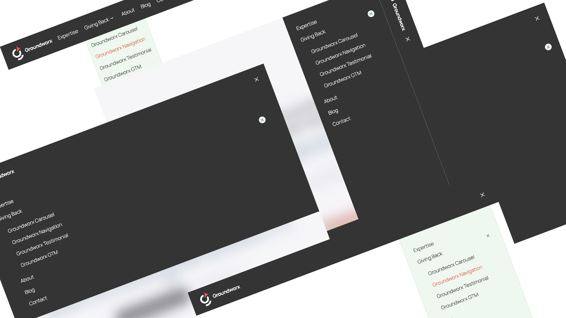
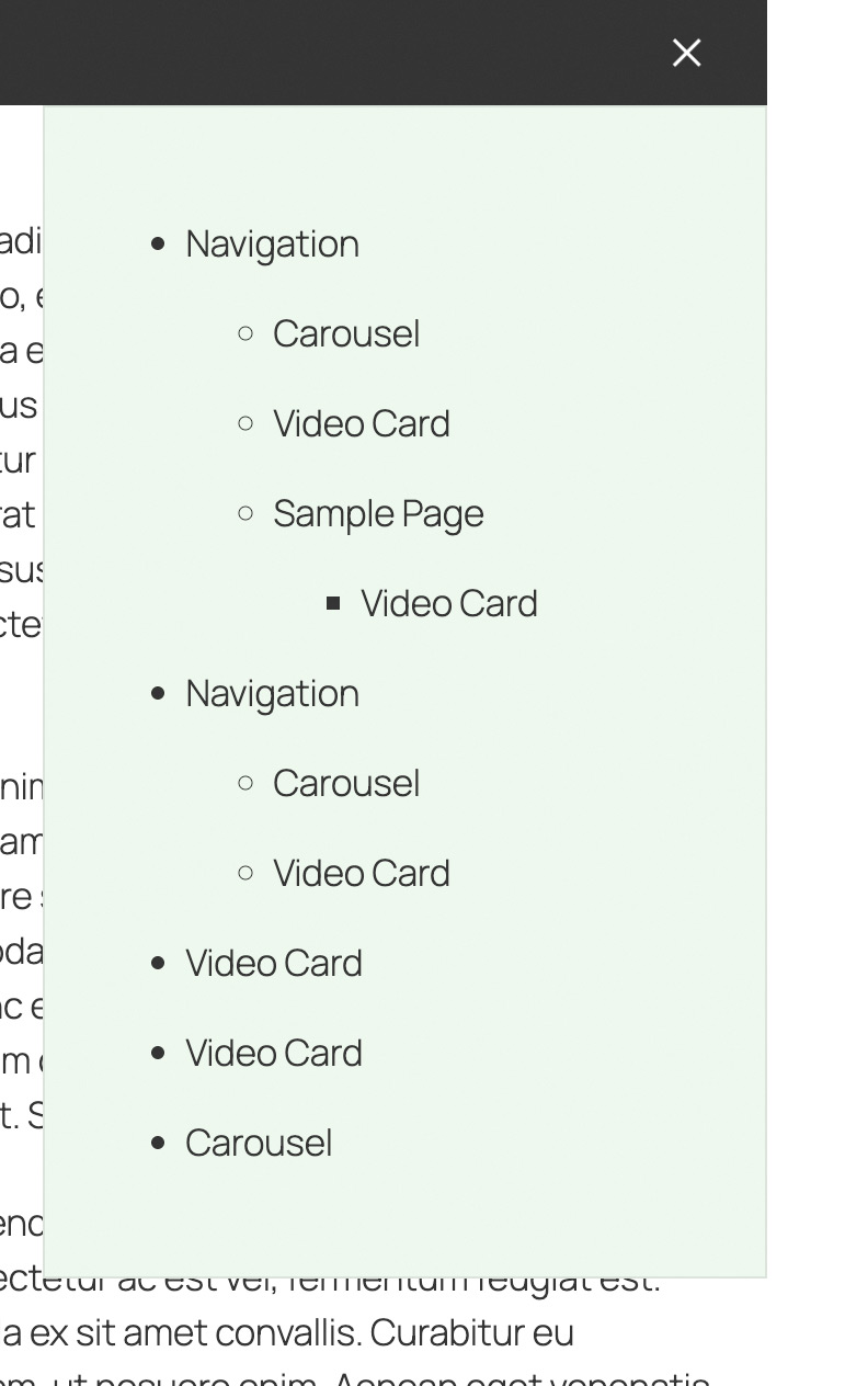
Professional Navigation Block for WordPress
Built for Modern WordPress
A lightweight WordPress plugin that adds a powerful, flexible navigation block to the Gutenberg editor. If you’ve struggled with the limitations of the core Navigation block, this plugin gives you better control—without the extra clutter. Professional navigation block with 4 responsive layouts. Mobile-friendly menus that adapt to any screen size, built with the Interactivity API for smooth performance.
Native Gutenberg Block
Everything happens inside the block editor—no shortcodes or legacy admin screens.
True Responsive Navigation
One menu that transforms across breakpoints—no cloning, no duplication. Your navigation automatically adapts its display and behavior based on screen size, without creating separate menu instances for mobile and desktop.
Lighter, faster, and easier to maintain.
- Better performance
- Easier maintenance
- Cleaner code
- Proper responsive design
4 Layout Options
Choose from Modal Full (screen overlays), Modal Dropdown (dropdown at the header), Slide-in (off-canvas, left-edge drawer), or Classic (inline tag cloud).
Flexible Menu Displays
Accordion, Stacked, Vertical, Vertical—Horizontal layouts to match any design.
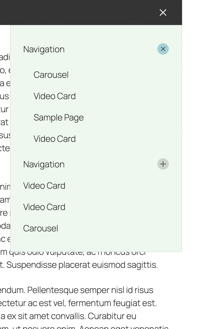
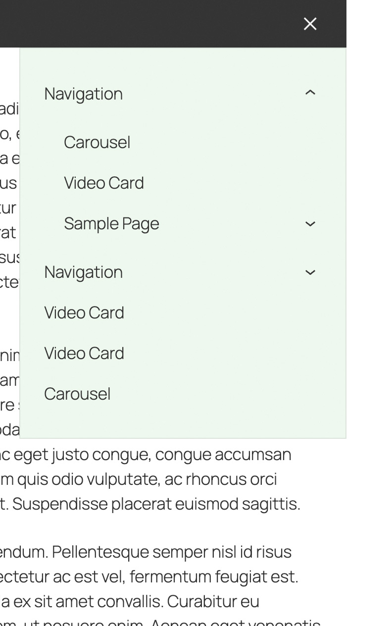
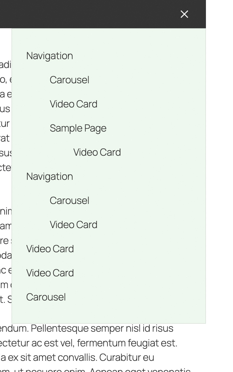
Included Gutenberg Blocks
Frequently Asked Questions
Need More Blocks?
Groundworx Testimonial is part of our free plugin collection. For a complete framework with 11 blocks, 12 core extensions, and unified responsive controls, check out Groundworx Core.