Feature your content. Build CTAs fast.
Cards, sections, and media layouts built for real projects. No shortcodes, no page builders, just blocks.
You need a hero section with background video. A card grid with hover reveals. A split layout with media on one side and content on the other. Building these from scratch means wiring up dozens of options — media handling, positioning, responsive behavior, animations, hover states, overlay controls. It takes time.
Cards & Sections packs all of that into blocks that just make sense. Background images or videos with overlay controls. Hover layers that swap media on interaction. Scroll-triggered animations. Content positioning with a 9-point grid. Responsive stacking with custom breakpoints. Width ratios you can actually control. All exposed in the editor, all working together.
These aren’t simple layout blocks with a few options. They’re presentation blocks built for visual impact — with the controls you’d expect from a page builder, but native to WordPress.

Groundworx Cards & Sections
Version 1.0.1
WordPress version 6.5 or higher
Tested up to 6.9.0
Built on WordPress standards
Uses @wordpress/interactivity for interactions and GSAP for scroll animations. Real blocks with real controls — not shortcodes, not page builder modules.
Cards & Sections the WordPress way.
Built on the standards WordPress chose. Not around them.
GSAP animations
Scroll-triggered animations powered by GSAP — the industry standard. Smooth, performant, professional. No amateur CSS keyframes.
Interactivity API powered
Hover states, reveals, and layer interactions use WordPress’s own Interactivity API. The same technology WordPress core uses. Modern, fast, native.
Real blocks, real controls Typography, colors, spacing – all in the editor. Respects your theme.json. Styles the way WordPress intended.
Works with any theme
No forced styles, no design conflicts. Reads your theme.json for colors, spacing, and typography. Your theme stays in control.
Performance built in
Video backgrounds lazy load. Hover videos load on demand. Animations only trigger when needed. No wasted resources.
Clients can manage it Swap images, edit text, update content — all in Gutenberg. No developer needed for everyday changes.
6 Blocks. Complete Control.
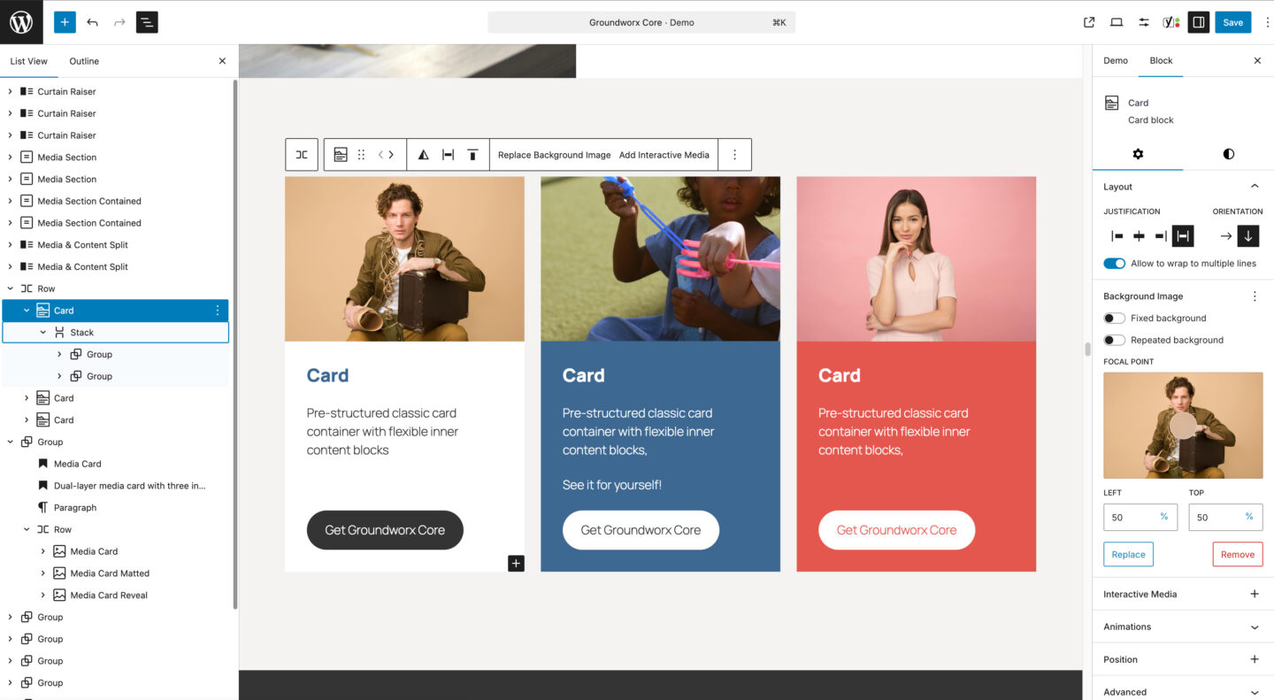
Card
A classic card block with a background image and optional interactive hover layer (image or video). The flexible content area below accepts any blocks you choose—headings, text, buttons, and more.
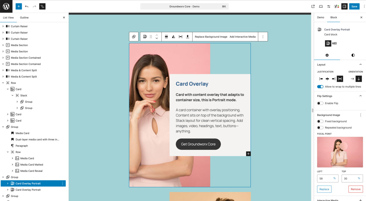
Card Overlay
A card block with a content panel that overlays the background image. Available in portrait and landscape layouts, with a flexible content area for any blocks you need. Supports a background image and optional interactive hover layer (image or video).
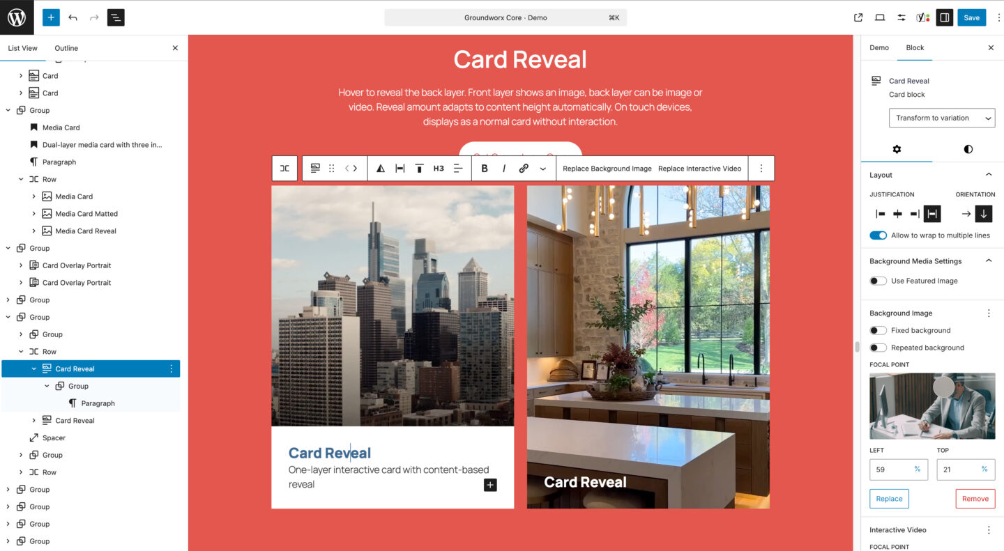
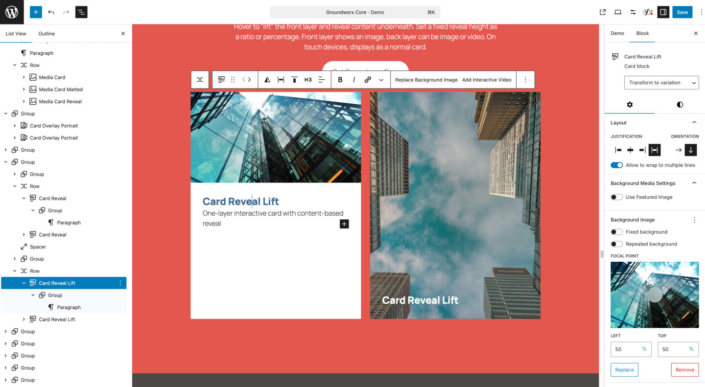
Card Reveal
An interactive card block that displays a title over the background image, then reveals additional content on hover. Supports a background image and optional video hover layer. Available in two layouts: default and lift.
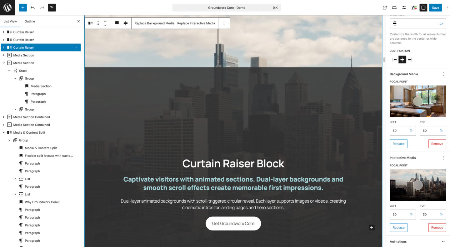
Curtain Raiser
A full-height section block with dual media layers and scroll-triggered animation. The first layer stays static while the second reveals through a growing circle effect. Content scrolls up and locks into place. Both layers support images or videos.
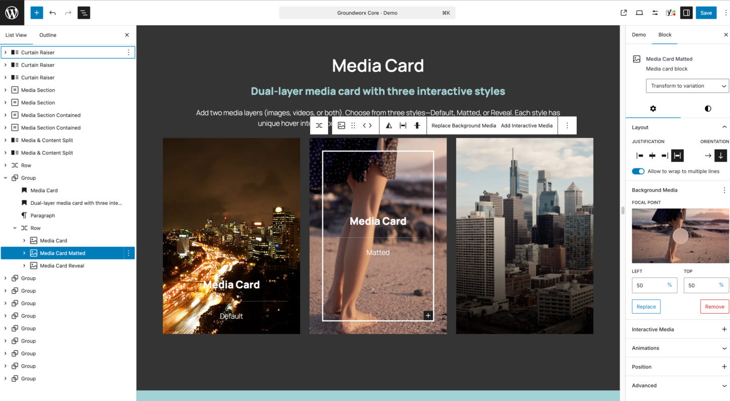
Media Card
A dual-layer media block with content that overlaps the background. Supports background image or video, plus an interactive hover layer. Available in three styles: default (content visible), matted (framed border with zoom effect), and reveal (content appears on hover).
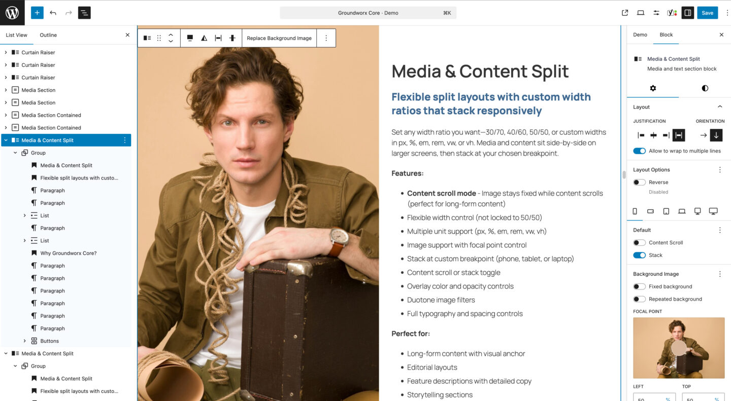
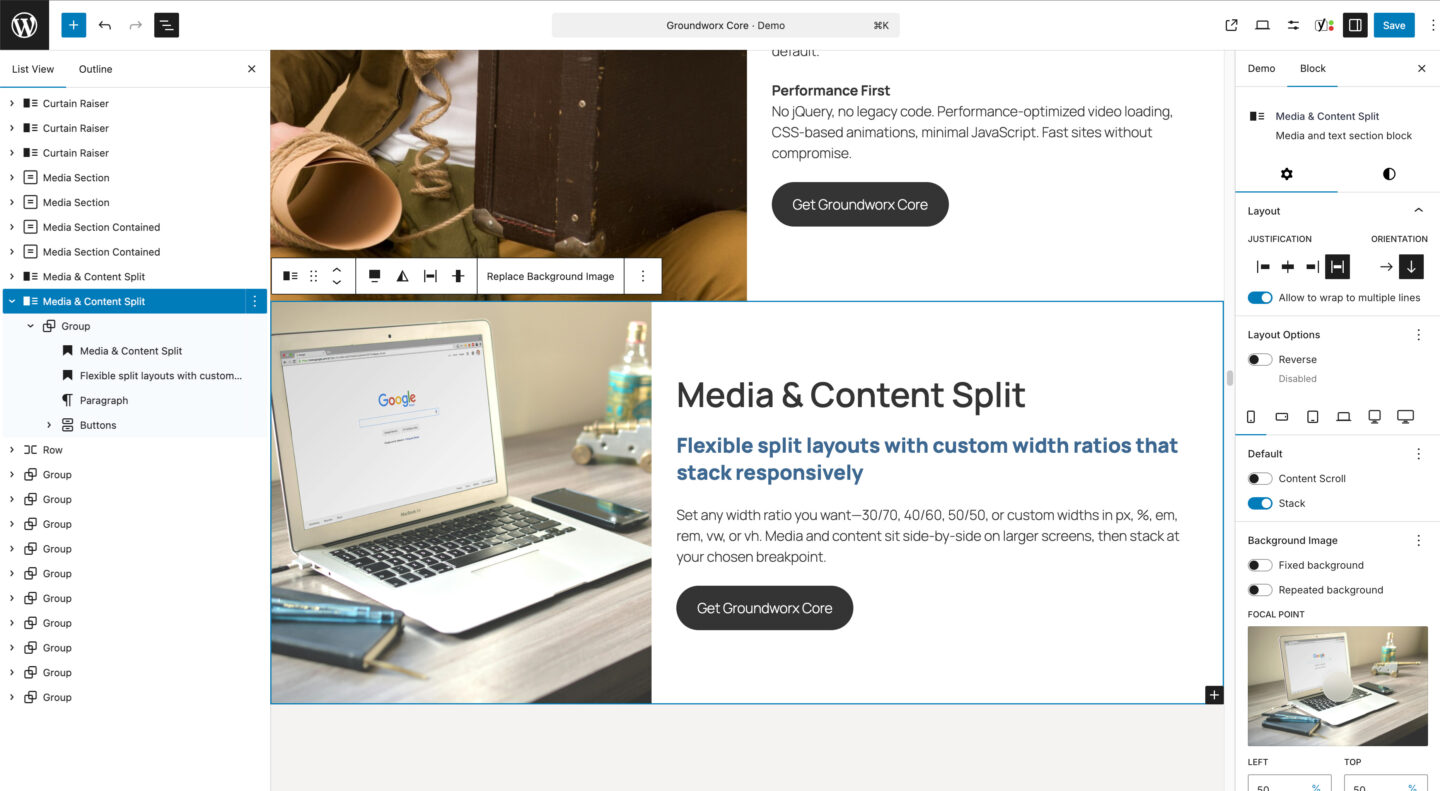
Media Content Split
A responsive split section block with media on one side and content on the other. Set custom width ratios and choose when it stacks on smaller screens. Supports background images with overlay controls.
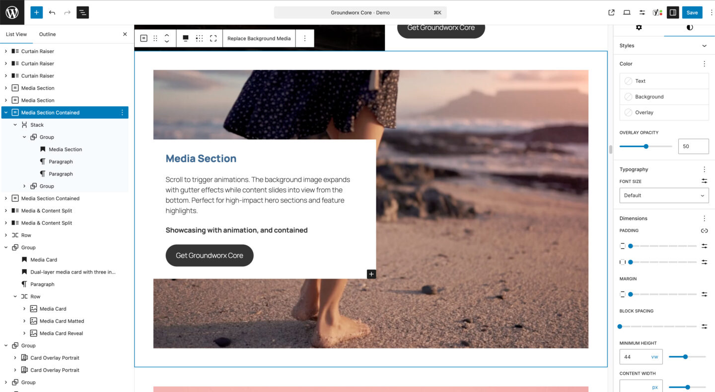
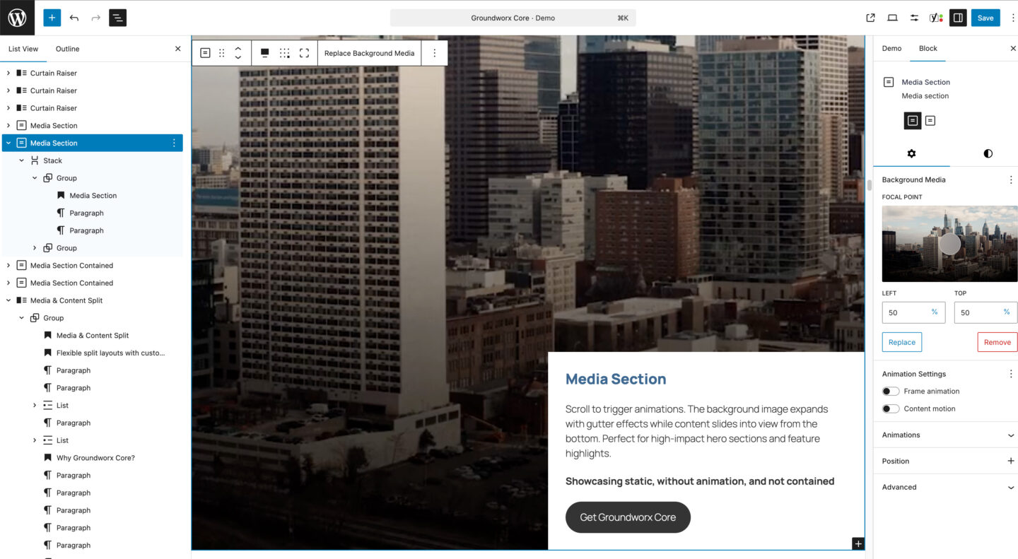
Media Section
A full-width section block with background image or video and flexible content positioning. Use the 9-position grid to place content anywhere. Includes optional scroll-triggered animations for the frame and content. Available in contained and edge-to-edge layouts.
Build more. Override less.
Groundworx Cards & Sections is available standalone or as part of Core bundle, the complete block toolkit for agencies and developers who ship client sites.
Blocks that extend your theme, not replace it.
Cards & Sections works with your existing design. It reads your theme.json, respects your spacing and colors.
- Landing pages – Hero sections, feature highlights, CTAs
- Portfolios – Project showcases with hover reveals
- Team pages – Staff cards with bios and social links
- Service pages – Split layouts with media and descriptions
- Case studies – Full-width media sections with scroll animations
- Product features – Card grids highlighting benefits
Pricing
Creator
$29.00
1 Domain License
1 Year Updates & support
All Features Included
Perfect for your own site
Freelancer
$89
10 Domains License
1 Year Updates & support
All Features Included
Small Teams & growing agencies
Agency
$149
50 Domains License
1 Year Updates & support
All Features Included
Scale with confidence