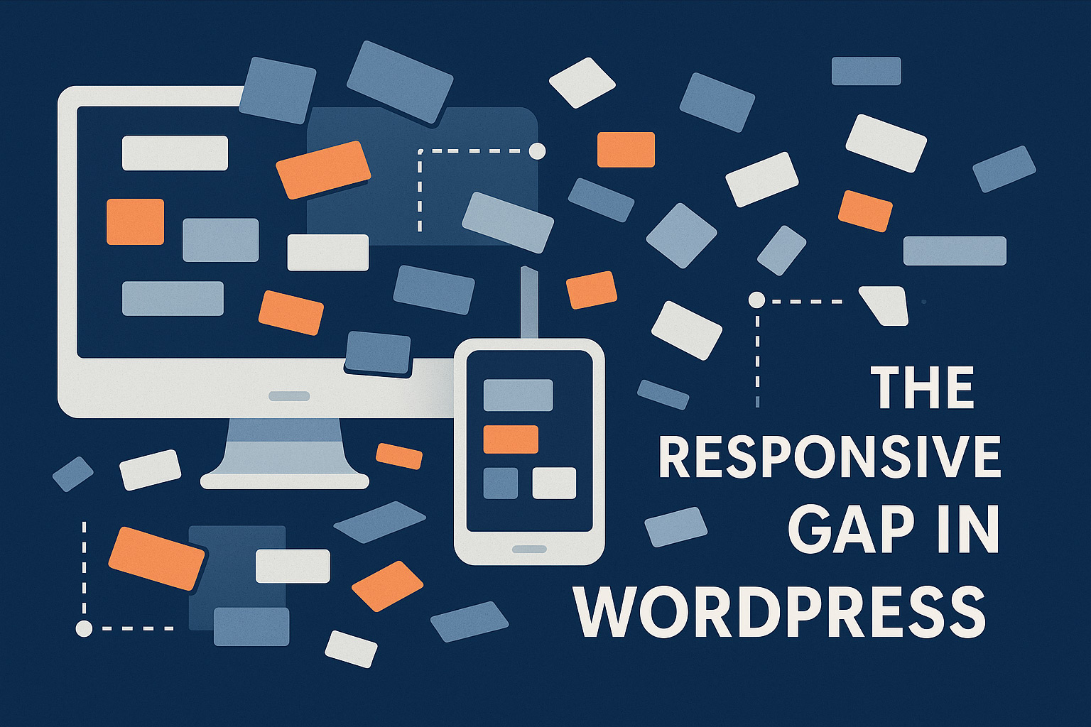
The Frustration is Real
If you’ve worked in a digital agency—especially one that builds websites at scale—you know the pain. The WordPress block editor has come a long way, but one of the most glaring issues remains: a lack of true responsive control. Breakpoints. They’re not a luxury—they’re a necessity. And yet, native support is still largely absent.
For agencies building WordPress sites at scale, responsive design isn’t optional—it’s foundational. Yet, despite years of progress in the block editor, there’s still no reliable, native way to manage breakpoints. This post is about the challenges that creates—and the patterns, tools, and mindsets that can help solve it.
Where the Editor Falls Apart
In the design phase, everything looks great. Designers create flexible layouts that adapt at mobile, tablet, and desktop widths. But when it’s time to implement them in WordPress, developers find themselves patching together solutions.
There’s no built-in way to define how a block behaves across breakpoints. Want a column to stack on mobile? You’re either manually adding classes, injecting custom styles, or building your own block variations. None of it is scalable—and none of it is something you want your content editors touching.
It’s Not Just a Developer Problem
And that’s really where the problem compounds: the editor experience.
As a developer, you can work around the limitations. But when an editor wants to tweak a layout and finds that things break down across devices, the trust is gone. They start adding margins where they don’t belong, or padding to “fix” alignment that only looks broken on one screen size. You end up with bloated, inconsistent pages that are hard to maintain and even harder to QA.
Agencies feel the impact in every project cycle. More time spent on implementation. More back-and-forth on testing. More questions from clients wondering why the site doesn’t “just work” the way it was designed.
This isn’t just a frontend issue—it’s a workflow issue.
Why Isn’t This in Core?
Still, it raises a bigger question: why hasn’t WordPress solved this yet?
We’ve seen improvements—spacing tools, layout controls, and experiments like the layout system in group blocks. But breakpoints are still not a first-class citizen. There’s no unified way to define them in theme.json, no API to declare responsive attributes, and no visual cues in the editor that help you understand how blocks behave at different sizes.
The irony is, this isn’t a cutting-edge feature anymore. Page builders, design systems, and modern frontend frameworks have long embraced responsive-first thinking. WordPress should be leading here, not lagging behind.
A Different Way Forward
In my own work, I’ve started approaching this differently. I’ve been building a modular system of custom blocks designed to embrace breakpoint logic from the start.
That means:
- Block attributes that are explicitly responsive
- Inspector UIs that allow switching between mobile, tablet, and desktop views
- Behaviors that feel predictable and transparent
If something stacks on mobile, it does so in a way that’s visible and editable—not hidden behind a custom class or some magic CSS.
I’m also relying heavily on theme-level design tokens but allowing for per-instance overrides when needed. The key is to empower developers to create flexible components, while still letting editors work safely within guardrails.
Bridging the Gap With Practical Tools
Until breakpoints become a native part of WordPress, agencies and developers don’t have to sit still. There are modern, reliable strategies that can fill the gap—without overwhelming content editors or adding maintenance nightmares.
One of the most effective tools is the clamp() function. By using it for things like font sizes and spacing, we can simulate responsive behavior without needing explicit media queries or per-breakpoint settings.
For example:
font-size: clamp(1rem, 2vw, 1.5rem);
padding: clamp(1rem, 4vw, 3rem);
This single line handles small, medium, and large screens—scaling smoothly based on viewport width. It’s performant, intuitive, and works out of the box in all modern browsers. I’ve integrated this into my custom block systems and even into theme.json spacing and typography tokens to ensure consistency without complexity.
When paired with:
- Logical spacing scales (like 4px or 8px steps)
- Fluid typography tokens in
theme.json - Clear design constraints for editors
…it becomes possible to deliver responsive designs that feel intentional, not hacked together.
And for developers who need more control, you can still override the default content styles with your own SCSS breakpoints. This gives you full flexibility under the hood, while keeping the editor experience clean and focused on intent.
What We Build Now Shapes the Ecosystem
WordPress is powerful because of the community behind it. Core may not support responsive controls the way we need (yet), but that hasn’t stopped developers from building smarter systems. Every plugin, theme, or block that addresses these gaps helps move the ecosystem forward.
Whether you’re using clamp(), building context-aware layouts, or creating editor experiences that hide the mess and expose only the meaning—you’re helping shape what WordPress can become.
We don’t need to wait to build better tools. We just need to build them well.